2020
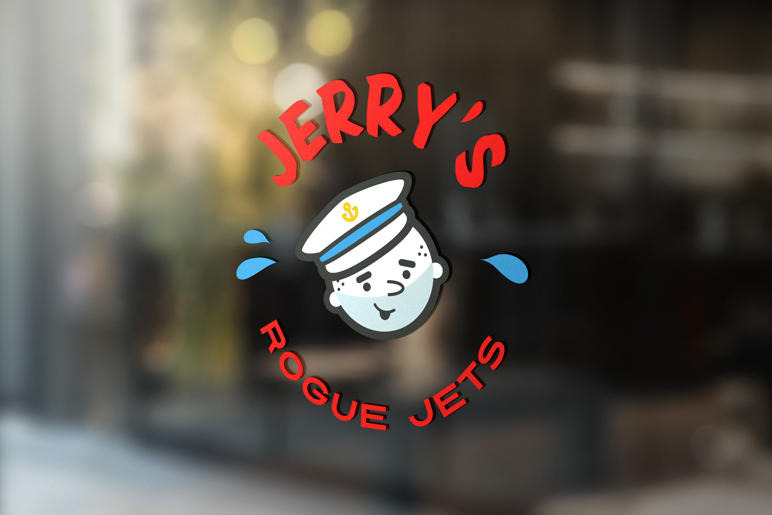
Jerry’s Rogue Jets
Brand identity
Creative Direction & design
illustration
Environmental Design
Partners: Holly Macfee and Andrew Dickson
Jerry’s Rogue Jets has been operating since 1895. Starting as a mail route serving the remote Rogue River Wilderness on the Southern Oregon Coast, they now provide fun-filled jet boat rides for adventurers and leisurely nature tours for the whole family.
Looking to refresh, Jerry’s Rogue Jets asked us to reimagine their brand. We agreed the Jerry of today is clean and modern, but we kept a retro feel to harken back to the company’s history and to portray their core value: FUN.
The colors in the brand’s new palette were grounded in the red and blue of the actual boats. We felt strongly it was important to tie the brand into the actual experience. The supporting colors were chosen to accentuate the boats; up until the rebrand, Jerry’s had multiple hues of red, yellow, brown, maroon and dark green which made the brand feel dated and inconsistent. The brand’s new typefaces were chosen specifically to reveal a playful, spirited nature, rooted in history, and we even developed some patterns, all combining together to bring our sailor Jerry to life.